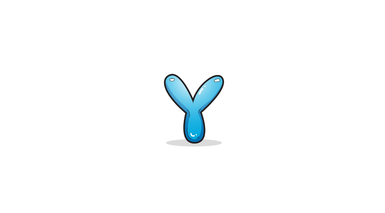
How to Draw A Bubble Letter Y. Y is the penultimate letter of the alphabet, making it the twenty-fifth letter overall. It’s a letter with similar shapes whether you write it in lowercase or uppercase, with only minor differences.
Also check our Printable Dolphin Coloring Pages.
In any case, it is written with three connected lines. This means that learning to write is not that difficult and can be mastered quickly. This guide will show you how to make this letter a little more exciting. We’re going to do this by learning to draw a bubble with the letter Y.
This is done in 6 fun and easy steps that will teach you everything you need to know. We’ll also look at some ways to make it more unique while leaving room for your creativity!
How to Draw A Bubble Letter Y
Step 1
As mentioned in the introduction, Y is a letter with three lines that all meet at one point. This will also be the case with this version of the bubble letter.
When writing a Y, use fairly straight lines. Our goal is to make it look like a bubble, so we avoid using straight lines.
For starters, you can draw a regular Y, preferably with something you can erase later. This capital letter can be drawn with straight lines as it forms the skeleton of the bubble letter.
We’re going to keep the first line of this guide simple. We draw a simple curved line that will form the beginning of the “arm” on the left.
Just draw it as it looks in our reference image, then we can move on to step 2.
Step 2
In this second phase, we will finish this first part of the letter. To do this, continue with the line we started in step one.
Just keep the line curved until it curls back on itself as we see in the reference image. This will give us the rounded first arm of the letter.
All parts of this letter Y have a similar rounded appearance and texture as this first arm.
We will draw these parts in the next few steps. So if you are happy with the look, we can move on to the next part.
Step 3
In step 3 we are essentially repeating what we did in step 1 of this bubble letter Y. This means we’re going to draw another arm, except this one looks more like a leg.
What we mean is that this rounded section is sort of what the letter sits on. Just use another long curved line that connects to the first arm.
In our example, we made the leg fairly short, but you can make it longer if you like. That’s all for now!
In the next step, we’ll complete the outline of your letter so you can add some fun interior details.
Step 4
Now you’ve really got the hang of it! You’ve drawn three sections of this letter Y so far, and there’s one more to do.
You can see there is a gap in the upper right corner of the letter which we will now fix. That means pulling another arm for the letter.
Now you know how to do it: another curved line to fill in the gap. The reference image shows you how it should be angled.
Once we’ve drawn it, we’ll have our complete Y outline! However, we’re not done yet, and this pattern opens up a few possibilities that we’ll explore in the next few steps.
When the schematic is complete, we no longer need the normal Y that we suggested in the first step. You can now erase it once you’ve drawn it as it just clutters the page.
Now let’s move to step 5 and look at some of the internal details we can add.
Step 5
In our opinion, this letter Y already looks good. But we can make it look even better!
We’ve decided on a bubble letter and these next few details will help make it feel more like that. If you’ve ever made bubbles, you know they reflect light.
We’ll make this letter have the same effect by drawing reflective dots on it. For our example, we placed these reflective dots on the upper arms of the letter.
This gives the impression that there is a light source above the letter shining on it. If you want the light source to come from a different spot, simply draw these ovals somewhere else on the letter.
You’ll also see that we’ve added some thin, slightly curved lines inside the letter. These also help make it look like a bubble as they add some depth to the design.
Here are the details that we recommend adding. However, you can take a different approach if you like! There are loads of fun details you could add.
If you don’t care too much about making it look like a bubble, you can cover it with patterns or shapes instead. Not only would that look cool, but it would also allow you to add more colors.
There are so many options for more details! We’ll also go through other fun ideas for you to try in the next step, so stay tuned.
Step 6
A design always looks better with some color and we will add something in this sixth and final step. The best thing about using color is that there is no wrong choice!
As you fill in your design, you’ll have the opportunity to try your favorite colors. First, we’ll use our reference image as an example.
As you can see, we used a nice soft blue color scheme for our image. Even if you choose a different color scheme, you can still use the technique we use.
We used lighter and darker tones of this blue to make some parts of the image look even more like a light shining on them.
Whether you use warmer colors or different colors, you can use the same trick to add depth to the letter.
If you want to make it themed you can use yellow as it starts with Y too! These are just suggestions, but now we want you to share what colors you think to complement this image.
Additionally, you can show off your skills by using different artistic tools and mediums to make the colors look even better!
Your Bubble Letter Y Drawing is Finished!