In the vibrant world of design, color plays a pivotal role. Whether you’re working on a brand logo, designing packaging, creating marketing materials, or planning an interior, the choice of colors is a critical decision. That’s where Pantone steps in. The Pantone Color Matching System, often referred to as the PMS, is a universal language for designers, printers, and manufacturers to ensure that the colors they choose are precise and consistent. In this comprehensive guide, we will explore the world of Pantone colors and the Pantone Matching System, providing you with everything you need to know to make 2023 a colorful success.
What is Pantone?
Founded in the 1960s by Lawrence Herbert, Pantone Inc. has become the global authority on color. The company standardized a color matching system that allows different manufacturers, designers, and printers to communicate accurately about color.
The Importance of Pantone Colors in 2023
In a digital age, why are Pantone colors still crucial in 2023? Here are some reasons:
1. Consistency
One of the primary advantages of Pantone colors is consistency. When you choose a Pantone color, you can be confident that the color you envision is the color you’ll get, regardless of where it’s reproduced. This is essential for vector artwork services branding and logo design, ensuring your brand colors are identical on all marketing materials.
2. Color Combinations
Pantone offers a vast array of colors, and their system provides guidelines on how to combine these colors effectively. This is particularly valuable for designers working on projects that require specific color schemes.
3. Color Trends
Pantone is known for its Color of the Year, which has a significant influence on design and fashion trends. Staying up-to-date with Pantone’s Color of the Year can give your designs a contemporary edge in 2023.
Using Pantone Colors in Your Projects
1. Identify Your Needs
The first step in using Pantone colors is to identify your project’s requirements. What are you designing, and what colors do you need? Be specific about the hues and shades.
2. Consult the Pantone Color Guide
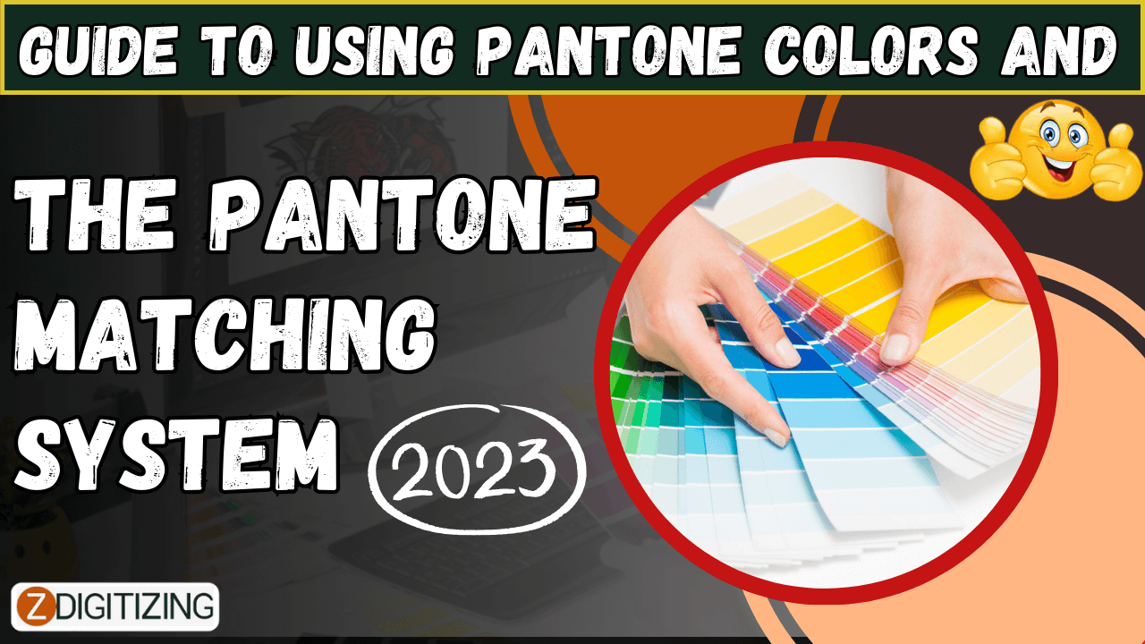
Pantone offers several guides, including the Formula Guide and the Solid Color Set. These guides provide color swatches and formulas for mixing ink to achieve the desired color. Choose the one that suits your needs.
3. Choose Pantone Colors
Use the guides to select the Pantone colors that best match your design. Pantone colors are typically labeled with a PMS number, making it easy to identify the exact shade.
4. Communication
When working with printers or manufacturers, provide them with the PMS numbers of the colors you’ve chosen. This ensures that your design is accurately reproduced.
Pantone Colors in Different Industries
1. Graphic Design
Graphic designers use Pantone colors to ensure consistency in print materials, such as embroidery digitizing services business cards, brochures, and banners. This is vital for brand identity.
2. Fashion
In the fashion industry, Pantone’s Color of the Year influences clothing and accessory designs. Fashion designers also use Pantone colors for fabric and accessory production.
3. Interior Design
Interior designers use Pantone colors to select paint, fabrics, and decor items. It’s an excellent tool for achieving a unified and aesthetically pleasing look.
4. Product Design
Product designers rely on Pantone colors to select the shades of plastics, metals, and other materials used in manufacturing.
Pantone’s Color of the Year 2023
Pantone’s Color of the Year for 2023 is “VeriFlora.” This lively and vibrant shade is described as “a fresh and rejuvenating green that represents growth, renewal, and our evolving relationship with the environment.” Expect to see this color making its mark in various industries, from fashion to interior design.
Conclusion
In a world full of colors, Pantone stands as a reliable guide for designers and creators. It ensures that the colors you imagine are the colors you get, providing a level of consistency and accuracy that is indispensable. By understanding how to use Pantone colors effectively, you can make your projects in 2023 truly remarkable and on-point with the latest color trends.
Frequently Asked Questions (FAQs)
1. Can I use Pantone colors in digital designs?
Yes, you can. While Pantone colors were originally developed for the printing industry, they have been adapted for digital use. Many graphic design software programs offer Pantone color libraries.
2. Is it necessary to use Pantone colors for every project?
No, not every project requires Pantone colors. They are particularly useful for projects that demand color consistency, like branding and logo design.
3. How often does Pantone update its Color of the Year?
Pantone announces a new Color of the Year annually. It reflects trends and influences in design and culture.
4. Are Pantone colors only for professionals?
No, anyone can use Pantone colors. While they are industry-standard for professionals, you can explore and utilize Pantone colors for personal projects and creative endeavors.
5. Where can I purchase Pantone color guides and swatch books?
You can buy Pantone color guides from the official Pantone website or from authorized resellers and bookstores. These guides are available in both print and digital formats.